Search for answers or browse about Sintel Forms.
Embedded Action Buttons
Open our helpdesk article: https://sintelapps.com/product-help-sintel-forms/buttons
Sintel Forms now gives you the ability to embed action buttons onto your form. Previously, all action buttons were kept on the top of the form on the toolbar. That meant once you finished filling out your form, you would click the “Actions” option on the top of the form to either submit, approve, reject etc…
Clients had enquired about embedding these buttons directly onto the form so we’ve added it 🙂
Embedding buttons is a simple 3-step process
Step 1 Add the buttons to the form
Step 2 Define what they do
Step 3 Style them
Examples of various buttons
Add the buttons
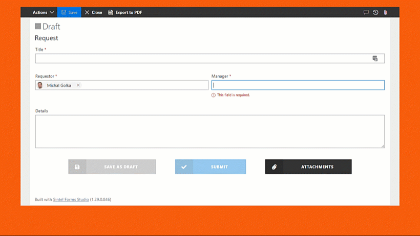
To add buttons to a form you need to add HTML into a section on the form. In my demo, I created two sections: one for displaying buttons when the form was in the Draft status and one for displaying buttons when the form was in the Submitted status.
The section that will be shown for the Draft status contains buttons:
- Save as Draft: This is equivalent to the Save form option.
- Submit: This executes the Submit action.
- Attachments: This opens the attachments panel.
<div class="EmbeddedButtonsContainer">
  <button class="EmbeddedButton CheckValidation SaveAsDraft" onclick="window.SFCustomLogic.saveForm();">Save as Draft</button>
  <button class="EmbeddedButton CheckValidation Submit" onclick="window.SFCustomLogic.submitForm();">Submit</button>
  <button class="EmbeddedButton Attachments" onclick="window.SFCustomLogic.attachFiles();">Attachments</button>
</div>
The section that will be shown for the Submitted status contains the following buttons:
- Approve: This executes the Approve action.
- Reject: This executes the Reject action.
- Attachments: This opens the attachments panel.
<div class="EmbeddedButtonsContainer">
  <button class="EmbeddedButton CheckValidation Approve" onclick="window.SFCustomLogic.approveForm();">Approve</button>
  <button class="EmbeddedButton CheckValidation Reject" onclick="window.SFCustomLogic.rejectForm();">Reject</button>
  <button class="EmbeddedButton Attachments" onclick="window.SFCustomLogic.attachFiles();">Attachments</button>
</div>
Define what they do
Next, within the Logic screen, you’ll need to create a new Rule so that clicking on these new buttons actually does something. Create a new rule without any conditions and enable the “Run Once” flag. Add the “Execute custom js” step and paste your JavaScript into the step. Because the custom JavaScript is being evaluated during logic execution we need to define our onClick functions inside the window object.
var customLogic = function() {
  var self = this;

  self.saveForm = function () {
    saveForm(); //Sintel Forms JavaScript API to save form
  };

  self.submitForm = function () {
    executeAction("cc92bfe0-cf43-11eb-9885-e7e8cf1237e4");
  };

  self.approveForm = function () {
    executeAction("670e21f0-cf43-11eb-9885-e7e8cf1237e4");
  };

  self.rejectForm = function () {
    executeAction("751549e0-cf43-11eb-9885-e7e8cf1237e4");
  };

  self.attachFiles = function () {
    openPanel("attachments")
  };
};

window.SFCustomLogic = new customLogic();
Follow our Knowledge Article / The JavaScript API to get function details. The executeAction function that I used in the code sample above requires the Workflow Action ID as a parameter. The Workflow Action ID can be obtained by opening the Workflow screen in the Sintel Forms Designer and clicking the action icon as shown. 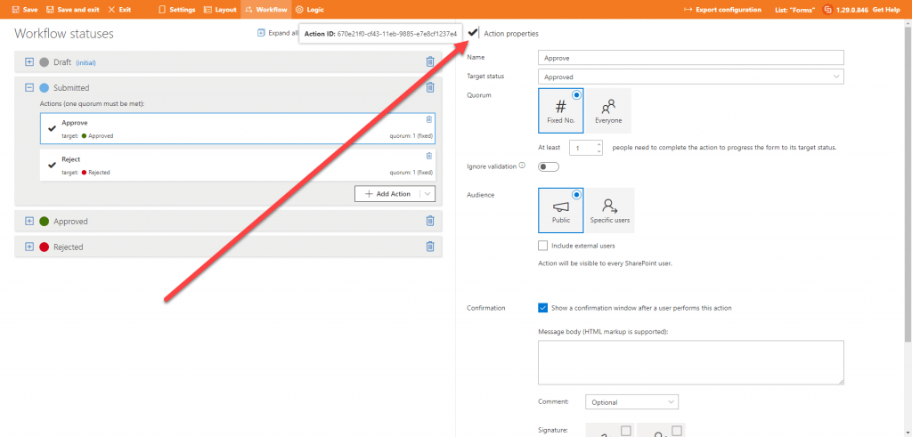
Style them
Now that you have added the buttons in Step 1 and configured what they should do in Step 2 the next step is to apply some styling. This is done by opening the Settings screen within the Sintel Forms Designer and opening the Theme & Styling tab. Here is the CSS I used in the demo:
.EmbeddedButtonsContainer {
  text-align: center;
}

.EmbeddedButton {
  border: none;
  background: none;
  cursor: pointer;
  display: inline-block;
  margin: 15px 30px;
  text-transform: uppercase;
  letter-spacing: 1px;
  font-weight: 700;
  outline: none;
  position: relative;
  -webkit-transition: all 0.3s;
  -moz-transition: all 0.3s;
  transition: all 0.3s;
  padding: 16px 60px 16px 120px;
}

.EmbeddedButton:after {
  content: '';
  position: absolute;
  z-index: -1;
  -webkit-transition: all 0.3s;
  -moz-transition: all 0.3s;
  transition: all 0.3s;
}

.EmbeddedButton:before {
  font-family: 'Font Awesome 5 Pro';
  line-height: 1;
  position: relative;
  -webkit-font-smoothing: antialiased;
  background: rgba(0,0,0,0.15);
  line-height: 3;
  font-size: 130%;
  height: 100%;
  position: absolute;
  left: 0;
  top: 0;
  width: 60px;
}

.form-with-validation-errors .EmbeddedButton.CheckValidation {
  filter: opacity(50%);
}

.EmbeddedButton:active {
  top: 2px;
  filter: brightness(75%);
}

.EmbeddedButton:hover {
  filter: brightness(125%);
}

/* .EmbeddedButton.SaveAsDraft */
.EmbeddedButton.SaveAsDraft {
  background: #9b9b9b;
  color: #fff;
}

.EmbeddedButton.SaveAsDraft:before {
  content: "\f0c7"; /* Font Awsome Icon */
}

/* .EmbeddedButton.Submit */
.EmbeddedButton.Submit {
  background: #3498db;
  color: #fff;
}

.EmbeddedButton.Submit:before {
  content: "\f00c"; /* Font Awsome Icon Unicode value */
}

/* .EmbeddedButton.Approve */
.EmbeddedButton.Approve {
  background: #417505;
  color: #fff;
}

.EmbeddedButton.Approve:before {
  content: "\f00c"; /* Font Awsome Icon Unicode value */
}

/* .EmbeddedButton.Reject */
.EmbeddedButton.Reject {
  background: #d0021b;
  color: #fff;
}

.EmbeddedButton.Reject:before {
  content: "\f00d"; /* Font Awsome Icon Unicode value */
}

/* .EmbeddedButton.Attachments */
.EmbeddedButton.Attachments {
  background: #333333;
  color: #fff;
}

.EmbeddedButton.Attachments:before {
  content: "\f0c6"; /* Font Awsome Icon Unicode value */
}
Note 1:
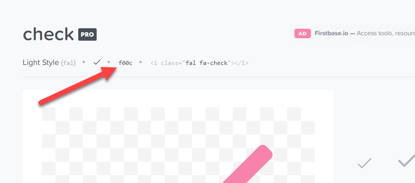
Sintel Form uses the Font Awesome professional. To find Unicode value for your icon simply open https://fontawesome.com, locate your icon and copy its Unicode value as presented on the image below.
Note 2:
If a form contains a validation error, the class form-with-validation-errors gets added to the form viewer. This allows visually disabling our embedded buttons using the CSS:
.form-with-validation-errors .EmbeddedButton.CheckValidation { filter: opacity(50%); }
Thanks for reading this article on how to embed action buttons onto your form. For all the latest updates on Sintel follow us on LinkedIn/Twitter/YouTube. This form template is available for you to download here.
If you are interested in trying this form or designing your own form the first step is to install Sintel Forms Studio into your Microsoft 365 tenant, get it from AppSource.