Search for answers or browse about Sintel Forms.
User Filter
1. What is a User Filter?
Data Filters can be configured to restrict records visibility based on defined criteria. There are currently three kinds of data filters available on Sintel BI.
- User Filters
- Date Filters
- Dropdown Filters
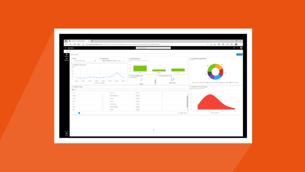
User filters let you filter information based on a particular person or user. For example, you could filter appointment information based on one employee.
2. How to add and configure a user filter.
The following steps explain the data configuration of the user filter:
Adding the user filter component
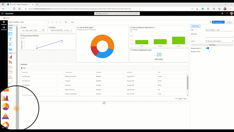
- Drag and drop the user filter icon from the toolbox into the design panel.
- Resize the widget as required.
- Select the date filter you have just added and in the properties section, you can name the filter and change any settings you wish.
- You can then select assign data and select your data source.
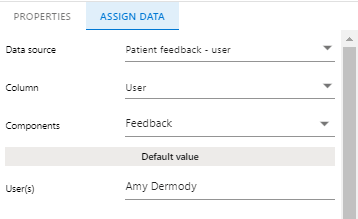
Assign Data
Please note that before adding a component you will need to define a data source. - You can then select your data source, the column you wish to take the data from (in this case I chose user). You can then select the components you wish to be influenced by your filtered data.(It is important to remember that the component you wish to be filtered will have to have user-driven data behind it so that it can actually be filtered by the user). I chose the feedback grid to be filtered by the user.
- For the default value, you can choose to use all users, a combination of users or just one user. This means when the dashboard opens it will be set to filter on your specified choice.
3. Properties menu options
The following image shows the various properties menu options based on the user filter.
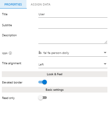
Title – This allows you to set a name for the component
Subtitle – This allows you to set a subtitle for the component.
Description – This allows you to show additional information in the form of a tooltip. It’s beneficial as it gives the user additional information without affecting the visualization.
Icon – Sintel Forms and Sintel BI both have Font Awesome embedded. This enables you to add icons to your components.
Title alignment – This determines the appearance and orientation of the component’s title. You can choose to align your text left, centre or right.
Look & Feel
Elevated Border – You can switch the elevated border on and off of your component depending on what you like best.
Basic Settings
Read-only– Read-only means that you will make the user filter unalterable therefore a user will be capable to view data within the user filter you set however they will not be able to view data related to other users
Once you have added your user filter and assigned data to it, make sure you save your work.
If you liked this article and would like to learn more about other components, click here.
To learn more about Sintel check our features or testimonials.
If you would like to learn more about Sintel Forms or Sintel BI book a no-obligation demo.
For the latest updates follow us on LinkedIn/Twitter & YouTube.